Mobile friendly
& Super Responsive in all devices
Cloud MLM Software is enhanced with a range of features. It includes both basic and pro features designed to accelerate the performance of your MLM business.
Cloud MLM Software is enhanced with a range of features. It includes both basic and pro features designed to accelerate the performance of your MLM business.
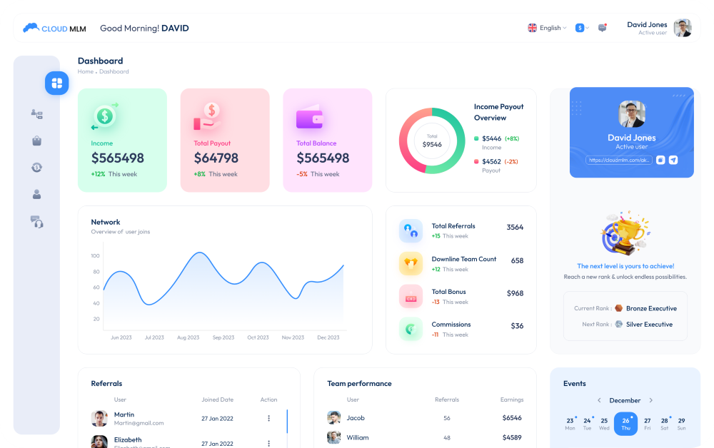
Our Cloud MLM Software is crafted with precision to enhance your MLM business experience on every device. It’s not just about accessing information; it’s about enjoying a smooth, intuitive interface that works effortlessly on your phone, tablet, or computer. We’ve designed every element to ensure that you can operate your business with ease and efficiency, no matter where you are. Here are the key features that make our software stand out.

Our software stands out by being exceptionally mobile-friendly and super responsive, guaranteeing a smooth and efficient user experience regardless of the device. Whether you’re on a smartphone, tablet, or desktop, our platform’s responsive design adjusts flawlessly, providing optimal performance and ease of use. This adaptability ensures that all users, regardless of their preferred device, have access to powerful functionalities and a consistent experience that meets today’s mobile-first standards. With our technology, you’re equipped to stay ahead in a mobile-centric world.