Powerfully Responsive
In recent years, mobile growth has surged dramatically. The increase in mobile internet usage has outpaced the growth of traditional internet usage, showcasing a significant shift in how people access online content.
In recent years, mobile growth has surged dramatically. The increase in mobile internet usage has outpaced the growth of traditional internet usage, showcasing a significant shift in how people access online content.
Responsive web design is one of the applications of developing a website appropriate to work on all devices and all screen sizes, no issue on how large or small, mobile, or desktop. Responsive web design is concentrated around giving an instinctive and satisfying experience for all. Desktop computers and mobile phone users are satisfied with responsive websites.
The application Responsive web design, well defined by Ethan Marcotte in a list apart reacts to the requirements of the users and the devices they’re using. The design transitions depend on the screen size and effectiveness of the device. For example, on a phone, the customers will view the matter displayed in a single column view, a tablet might show the same matter in two columns
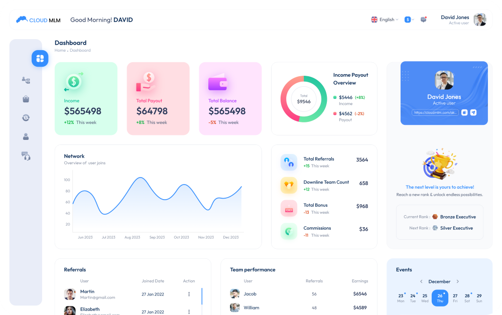
Cloud MLM software solutions provide you with powerfully responsive web designing facilities. The main UI feature of our MLM Software is that it is fully responsive. Using the latest technologies in front-end development, we have managed to give it a stunning look across all screen sizes. The software fitted to all screens. Cloud MLM software is purely responsive and it feels good on all devices.

Responsive web design is divided into three main elements, like flexible layouts, media queries, and flexible media.
flexible layouts is one of the methods of developing the design of a website with a responsive framework, suitable for dynamically resizing to any width. The responsive frameworks are made using relative length units, most commonly percentages or em units. These applicable lengths are then used to inform general framework property values such as width, margin, or lining.
Media query is a CSS module introduced in CSS 3 supporting content analysis to change to settings such as screen resolution (e.g. smartphone screen vs. computer screen). The primary aptitude might be to select media queries to build a responsive site. Though, the difficulty one faces with media queries is that new queries can develop from moment to moment; every time, the customer experiences quick and harsh changes to the look and system of the site.
Flexible media is the central point of the content like Facebook, Flickr, Instagram, YouTube, etc and it adds weight to the point of the page and it helps convey the page content purpose.
In earlier days, people primarily used desktop computers, so there was no need for designers to focus on responsive web design. With the development of advanced technologies and new devices, users now seek to use the best and latest devices available. First came laptops, then tablets, and so on. The new generation wants to browse the web easily and quickly. Through responsive web design, users can browse with any device they have. Web designers must develop websites that provide information across various screen sizes and resolutions. Your website should be flexible enough to work on a mobile phone or a large-sized LCD screen.
Responsive web design is very significant from a business viewpoint as well. It enables customers to visit your website from any device they have, increasing traffic to your site. This is why responsive web design is such an important feature to add to your website.
The features of perfect responsive web design are very helpful for everyone. Some of the best familiar features of the best responsive web design are specified below.
The world has evolved into highly progressive and at the same time, things have become very easy and useful. New technologies have been created to give people every type of satisfaction they desire. In this modern age, many new devices have come to existence like laptops, mobile phones, tablet PCs, and smart televisions.
Responsive web designing is a completely different designing form than traditional web designing, and developers must know about the pros and cons of it. All websites, although that site’s aims or the public that it helps, will gain from a display that works highly across various screen sizes and on different devices. By assuring that responsive web design is a feature that you make a preference on all website projects.
