所有设备均适合移动设备且响应速度超快
软件经过一系列功能的增强。 它包括旨在提高传销业务绩效的基本功能和专业功能。
具有强大的响应功能
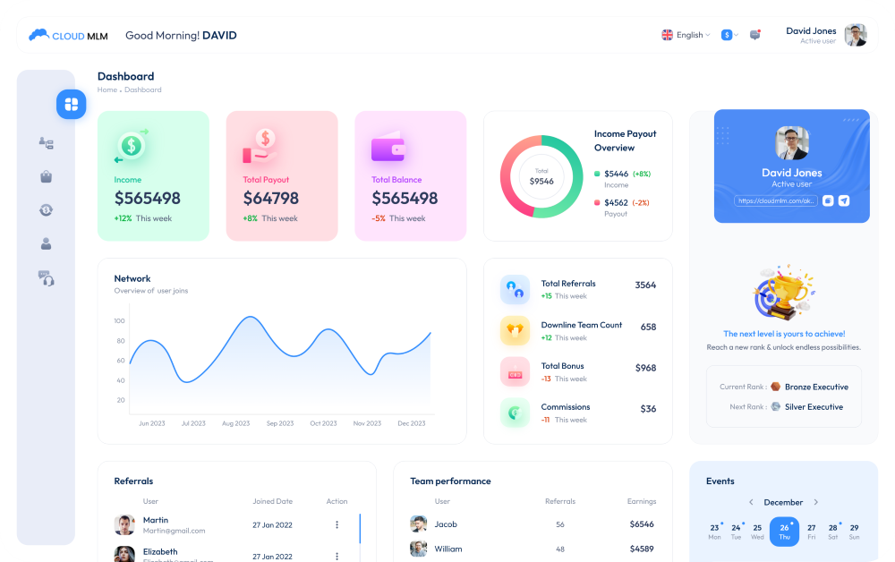
我们的云传销软件经过精心设计,可增强您在每台设备上的传销业务体验。 这不仅仅是获取信息; 它是为了享受在手机、平板电脑或计算机上轻松运行的流畅、直观的界面。 我们设计的每一个元素都是为了确保您无论身在何处都可以轻松高效地运营您的业务。 以下是使我们的软件脱颖而出的关键功能。

- 通过任何网络设备访问我们的软件,随时随地管理您的网络,确保您的业务运营不受干扰。
- 我们的软件可与客户关系管理、支付网关和电子邮件营销工具顺利集成,从而增强整个业务的工作流程和数据一致性。
- 通过所有设备接收有关业务指标和团队绩效的即时更新,帮助您迅速做出明智决策。
- 受益于顶级加密并遵守最新的安全标准,确保您的数据在任何设备上都是安全的
- 调整您的仪表板以专注于对您最重要的事情,从关键指标到通知和团队绩效。
- 在任何设备上体验清晰一致的界面,并自动调整以获得最佳的可读性和可用性。
跨所有设备的终极适应性
我们的软件因特别适合移动设备且反应灵敏而脱颖而出,无论使用何种设备,都能保证流畅高效的用户体验。 无论您使用智能手机、平板电脑还是台式机,我们平台的响应式设计都能完美调整,提供最佳性能和易用性。 这种适应性可确保所有用户,无论其首选设备如何,都可以获得强大的功能和符合当今移动优先标准的一致体验。 借助我们的技术,您可以在以移动为中心的世界中保持领先地位。